

Vrbo is a place for families and friends to dream about, plan, and travel together
My team focused on making shopping for vacation rentals effortless and enjoyable through personalization and relevance, no matter the device travelers chose.
Design Director - Shopping Experience (2018-2020)

Intro
I led UX for the search, discovery, and shopping teams, covering both web and apps, which were the primary revenue drivers for the company. I prioritized embedding UX into product teams and establishing healthy collaborative environments. I shifted the teams’ focus from short-term tactics to long-term strategic thinking, growing the team to meet business needs and coaching individuals towards their career goals. I initiated efforts for end-to-end consistency and introduced foundational research activities to drive a clearer understanding of customers. These initiatives helped create a cohesive and strategic UX approach, enhancing both team performance and customer satisfaction.
Vrbo apps can be downloaded from the Appstore, Playstore, or accessed directly from Vrbo.com
1. Modular property displays

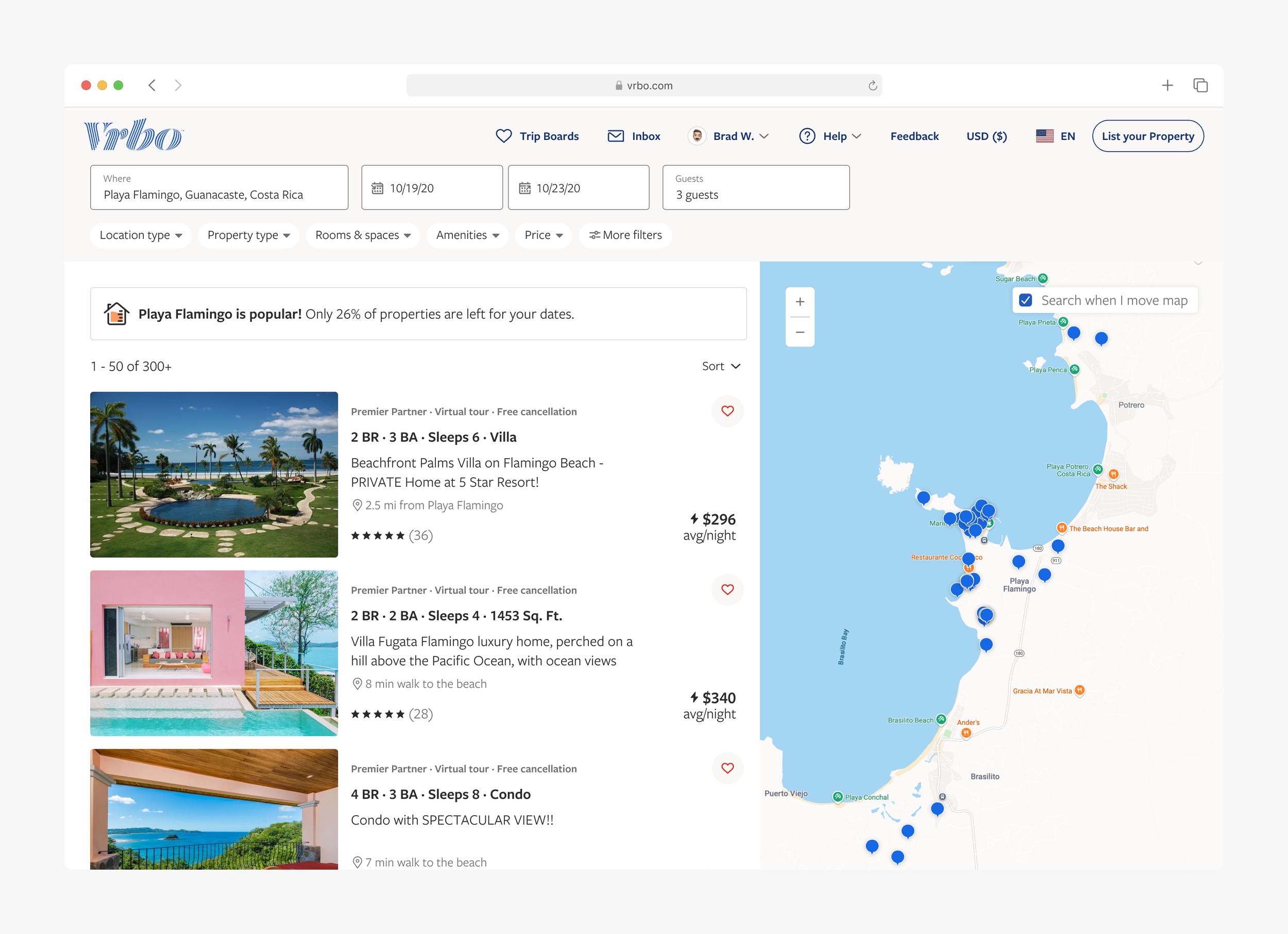
Problem
When travelers navigated Vrbo’s experience, depending what page or screen they were viewing, they would see different and/or inconsistent details about a property. The main reason for this was because individual teams were responsible for specific pages, and each team optimized independently for their own key success metrics. Over time, property displays diverged more and more.
As you can see in the screenshots above, when navigating from page to page, you would see the following inconsistencies:
Featured property image
Hierarchy and ordering of content
Property attribute highlights
Badging
Layout orientation
In addition, because each property display was built and optimized individually, we struggled to get clean results when testing different property recommendation models.

Approach
After my team audited and documented the experience issues, I pitched the opportunity to product stakeholders for increasing velocity and improving customer experiences by standardizing this experience with creating reusable components and assigning ownership to a single team. After many cross-team discussions, I got buy-in to kick off the effort.
To ensure we designed a flexible solution that supported the various use cases, we initiated research to better understand the following:
What property info is critical vs nice-to-have when a user decides whether to view the full property details?
What property information was most valuable at different stages of the shopping process, and was it different at each stage?
Solution
When it came to defining the solution, we understood from our research learnings that there was some property information that was always critical to display, such as; number of bedrooms and bathrooms, price, and ratings. Whereas other property information was only helpful in certain scenarios. For example, if a user initiates a search for “Playa Flamingo, Costa Rica,” it’s not helpful for the user to display that location on every property in the search results - it’s only helpful to display if one of the properties isn’t in that location.

We created a solution that used the size of the display to dictate how much (or how little) content we would show, and then established rules for content hierarchy and consistency.


Validation
Even though we used customer feedback to guide our design decisions, we still needed to validate that the end solution helped travelers discover the right properties more efficiently. We did this in three ways:
Usability testing
By creating task scripts that aligned with core discovery journeys, we challenged participants to find and decide on properties that matched specific criteria that was important for the group they would be traveling with.
Result: We were able to measure a reduction in task completion time against the control experience.
Short AB tests to gather signal on direction
We turned on two small temporary AB tests within different parts of the experience to ensure the changes wouldn’t have a negative impact on core success metrics.
Result: One test was trending positive, while the other was trending slightly negatively, but was still within a range we felt comfortable moving forward with.
End-to-end AB test
We ran a large scale AB test across multiple pages of the experience, including across web, iOS and Android apps. This test ran for multiple weeks to ensure we reached power in all parts of the experience.
Results
+3% increase in property bookings & increase in property engagement
This change proved to be the most successful test the Search and Recommendations team ran in 2019, but also increased the efficiency for future recommendation model changes, and increased experience consistency across our three app experiences.


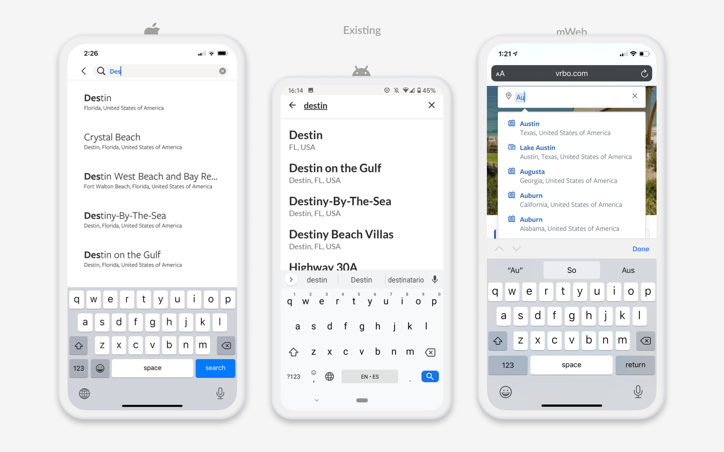
2. Consistent native search experience
Problem
Historically, our iOS and Android apps were owned by different teams, which naturally resulted in differing experiences. When bringing the teams together across Web, iOS, and Android, my team was able to highlight the inconsistencies that we had created over time and encouraged a future state where the content and functionality across the three platforms could be more consistent.
Our app functionality and design systems trailed what he had on our web experiences, so a big focus of this effort was to bring many of our new Vrbo design system pieces into our app experiences, including colors, type, components, etc. It was also important to include some of the search, recommendations, and filter improvements we had built on web into our app experience as well. Additionally, this was an opportunity to up-level some experiences within our apps due to better technology available in a native environment (like interactive maps).


Approach
My team started by auditing and highlighting the inconsistencies between platforms and deviations from our design system. We then started designing and prototyping a new search flow that aligned to our goals.
Because we were moving away from multiple different experiences, we decided to prioritize our research efforts towards usability instead of doing something more comparative. After multiple rounds of usability, and collecting feedback from our native and design system stake holders, we aligned towards one solution.

Solution


Results
This experience was being built when I transitioned to Indeed in October of 2020. Though I don’t know what impact these changes had on company success metrics, these did role out to all users as the default experience shortly after my leaving.
3. Deeper customer understanding


Problem
Our teams previously relied on multiple, competing customer journey maps, but our understanding of how groups and families traveled together, and the challenges they faced, was limited.
To bridge this gap, I proposed in-home generative research and participatory design activities to deepen our insights and align on a single customer journey map. With support from senior leadership, I led the planning, developed the moderator script, facilitated sessions, led synthesis, and delivered a live readout to hundreds of viewers across Expedia.
Approach
Two teams (3 people each) went into 12 participants homes. We used contextual inquiry and participatory design methods to understand how they planned trips. All 12 people had just returned from a group trip with family or friends.
Learnings

Trip journey

We asked each participant to walk us through their recollection of each step of the trip journey. In doing so, we uncovered opportunities for our journey map to more closely map to the language and moments they shared with us.
Trip types

While each participant shared similar behaviors inside each journey step, the number and order of steps changed depending on the initial trigger and type of trip they were taking. We found three key trip patterns based on types of trips.
Traveler types

We identified 3 different user types and behaviors, where the members of the group would get involved at different levels. The core planner was the most active, the contributor became active during key moments of sharing or collaboration, and the passive member was active during inspiration and stay.
Sentiment through the journey

We synthesized our participants’ memories of emotional sentiment across the journey. All 12 participants gave us their recollection of each moment and task, allowing us to identify areas where we could elevate positivity while alleviating stress and complexity.
Device switching

If we would have stopped by asking what devices were used in each phase, this graph would have looked very different, where mobile and desktop would have been persistent throughout their entire pre-travel journey. But by digging in a bit more, and learning how and what they were using the devices for, it became more clear that there were preferences and reasons for specific devices.
Example: One participant mentioned researching everything on his laptop. When he would find something he liked, he’d then copy the url into his phone so that he could text and share it with his brother. In this example, he wasn’t using his phone to research, but he was using it to share and communicate.
Creating a single customer journey map

We used these insights to establish a standardized customer journey, incorporating the language and key steps identified by our participants. We added details about each traveler type and their interactions with Vrbo’s product experiences and goals. To reinforce this perspective, we printed the journey maps as posters and displayed them throughout the office, ensuring they shaped how we approached our customers and products.
Other impacts
This study had far-reaching impacts beyond the journey map. It influenced organizational restructures, led to more customer-centric team naming, and directly shaped the launch of key group features such as group commenting, polling, and how we displayed property attributes.
“I’ve had the privilege of working with Randy from my 1st day at Vrbo. During that time, Randy led the Discovery/Shopping design team. He played a super-critical role in building out his design team and the broader UX team at Vrbo into what it is today. Even more importantly, Randy successfully fostered close, collaborative partnerships with others in engineering, product management, and product marketing in a way that moved teams from transactional focus to more aspirational and customer-first. His work leading Vrbo’s first generative, participatory design programs with travelers was a great example of this, which had positive rippling effects across our organization. Randy leads by example, which was loved by those he managed and mentored. They felt like they had a champion in our organization and could count on Randy to push them to create their best work. Lastly, Randy is just fun to work alongside. I always appreciated the camaraderie he fostered and hope to work with him again soon.”
Last updated: Dec 2024